![](https://cdn.myportfolio.com/6d26f1af9317e0791cad1ecdb2112497/fc35efc7-963c-4fa0-8134-2377450624e2_rw_1920.png?h=b297cca7c13d916ce36e2c40635ff141)
![](https://cdn.myportfolio.com/6d26f1af9317e0791cad1ecdb2112497/736d1168-21cc-4e73-bf73-e9bb50379313_rw_1920.png?h=ab4868ab878fa69e51e5cd23b86e4562)
![](https://cdn.myportfolio.com/6d26f1af9317e0791cad1ecdb2112497/cd54782c-aff4-46fb-bbc8-758dc358865e_rw_1920.png?h=83cf21959040e110163e7e66ee02aaf1)
![](https://cdn.myportfolio.com/6d26f1af9317e0791cad1ecdb2112497/ac057907-4890-482e-a7c6-cb55d811f61c_rw_1200.jpg?h=4ff71f48994eb7f75023669d65316bc8)
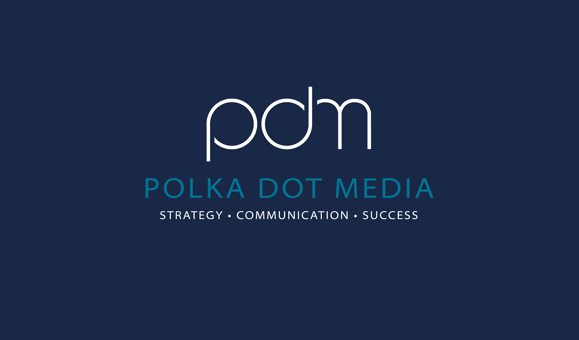
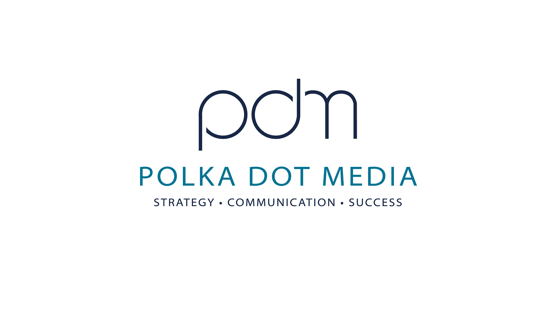
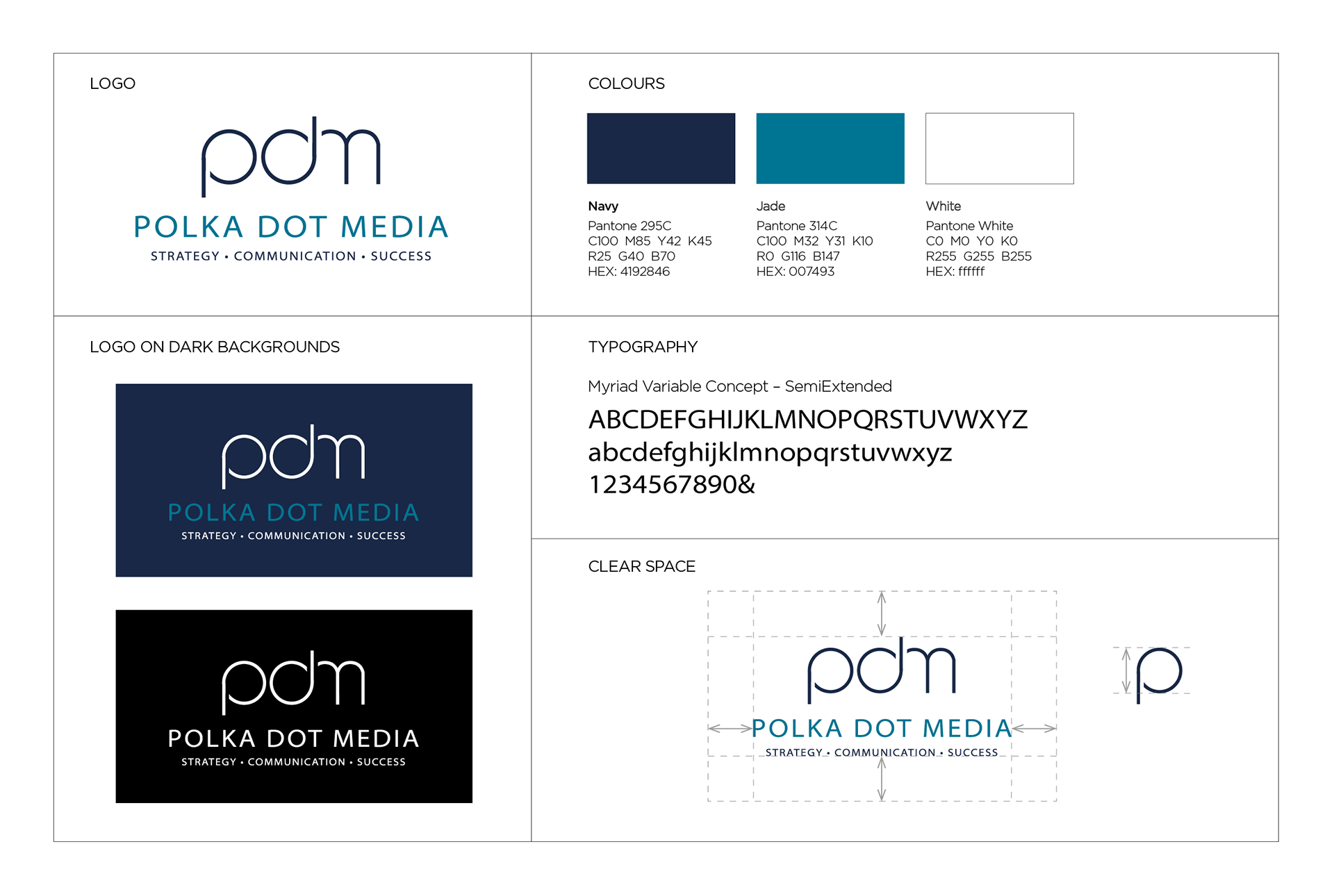
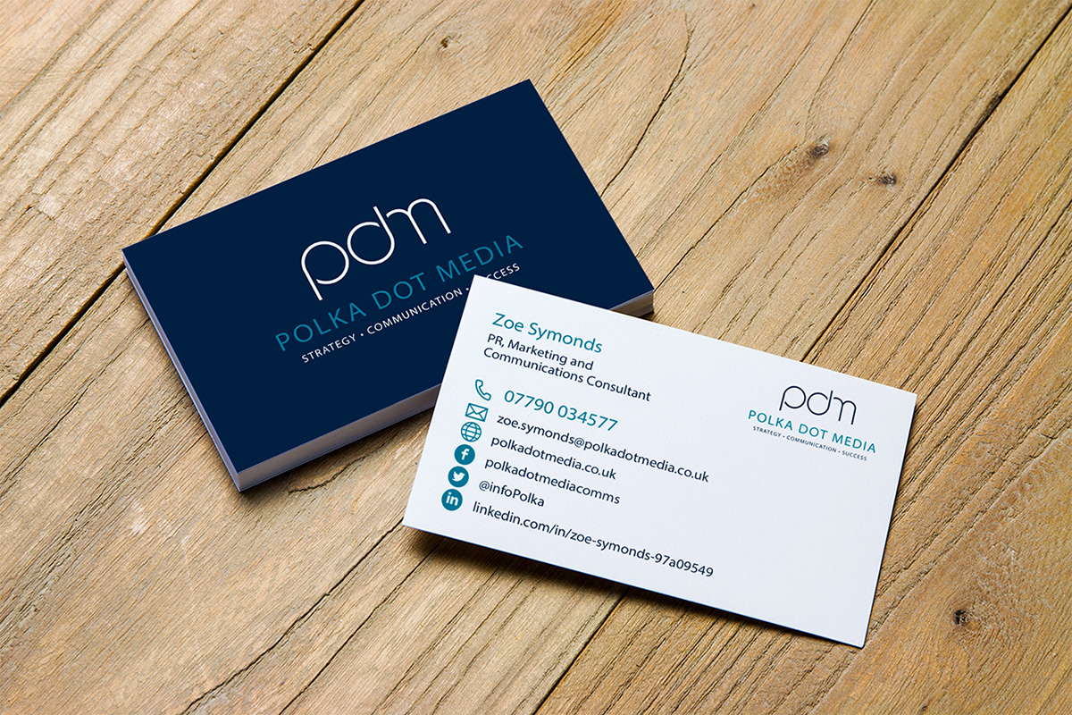
I previously created the original branding for PR & Communications agency, Polka Dot Media, using polka dots and lots of colour. Five years later, with the company evolving and growing, founder, Zoe Symonds wanted a brand refresh. For this new look, a more corporate, sophisticated look was requested – to better reflect the customers the agency now work with. Alongside this, we felt a clear and concise strapline which encompasses all the different aspects of the agency's work would be beneficial to both clients and the business.