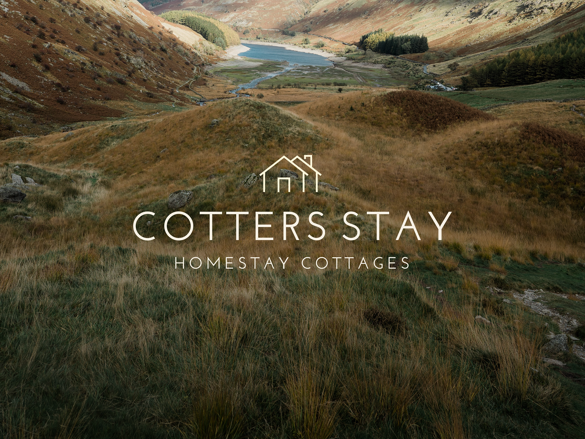
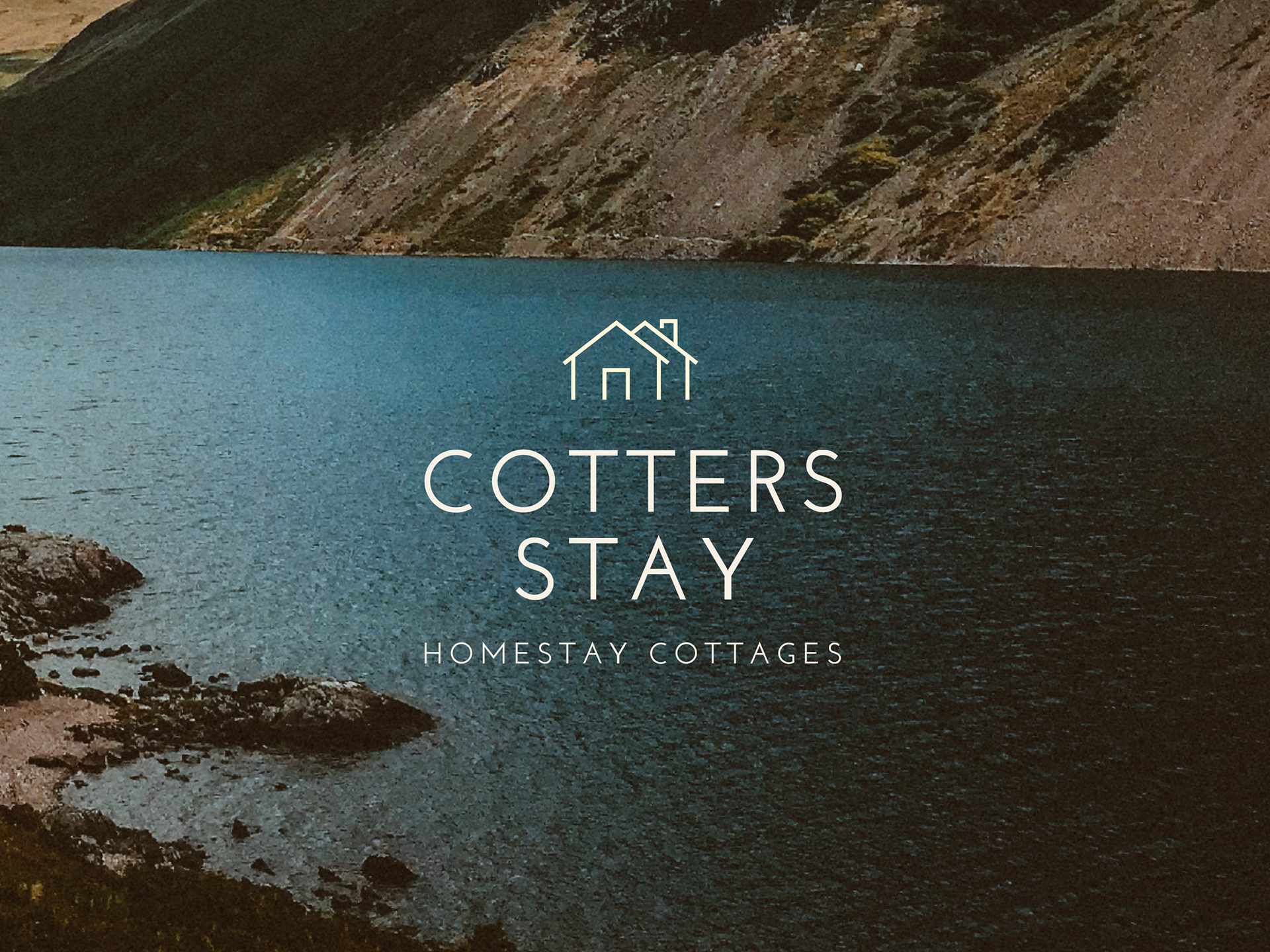
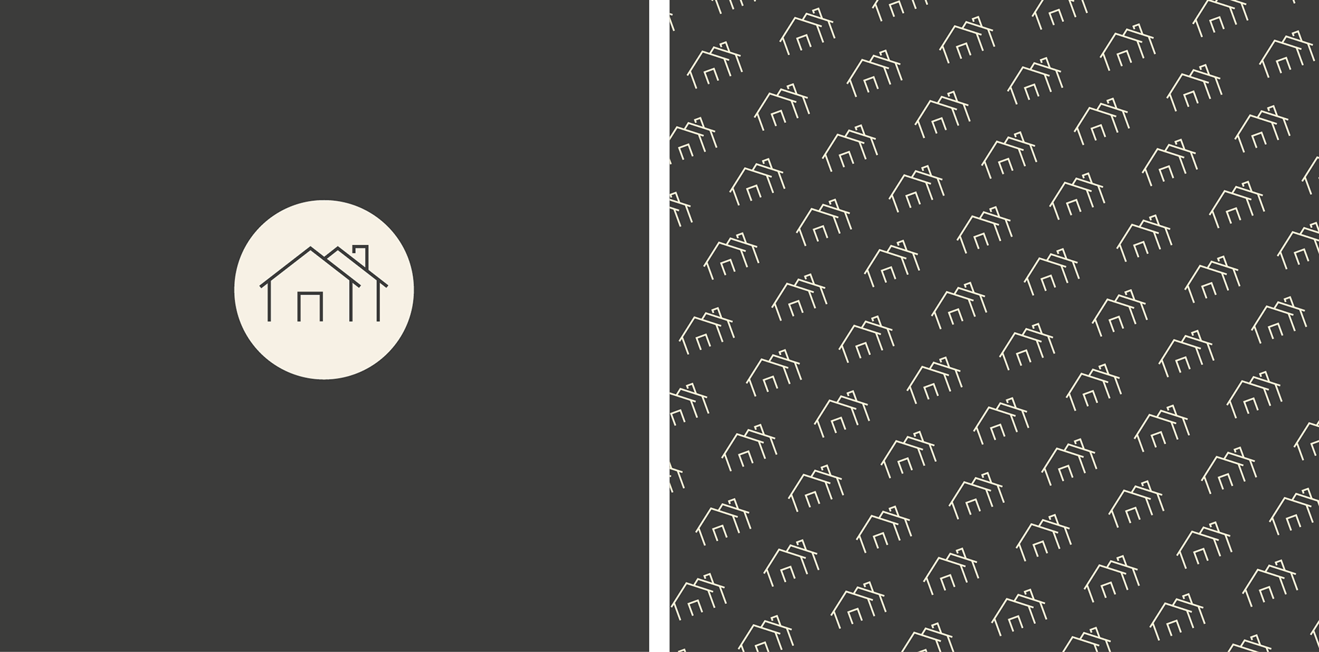
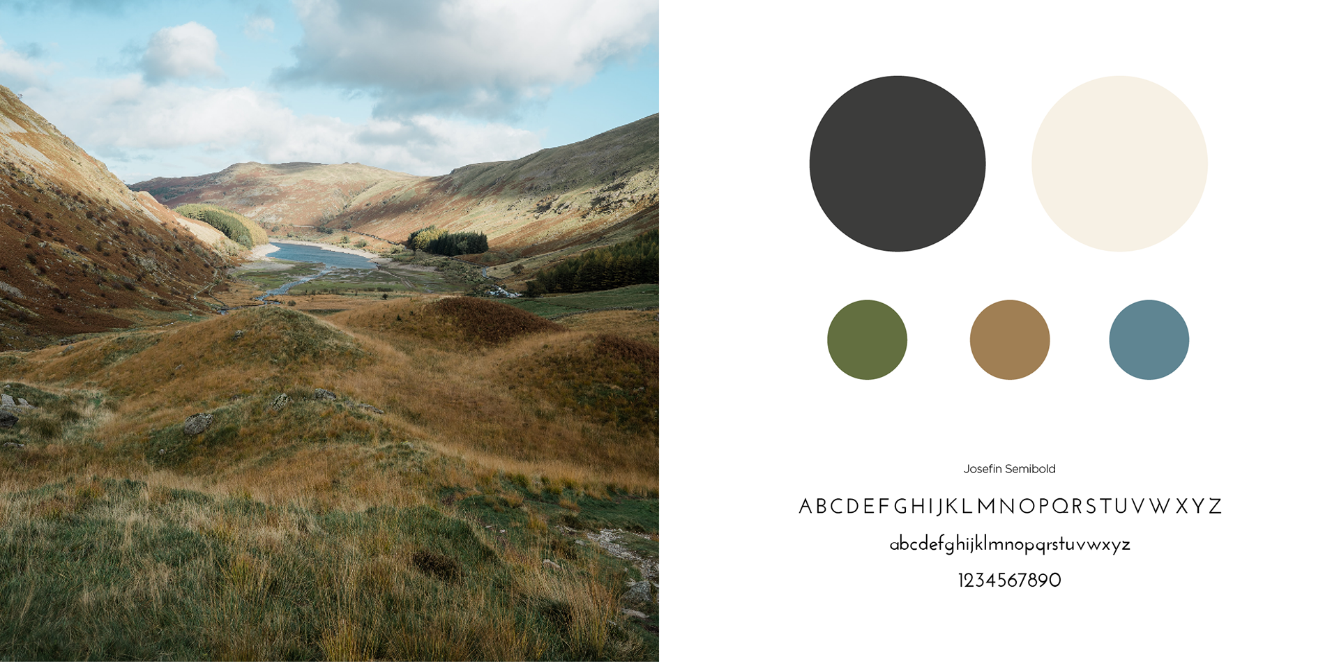
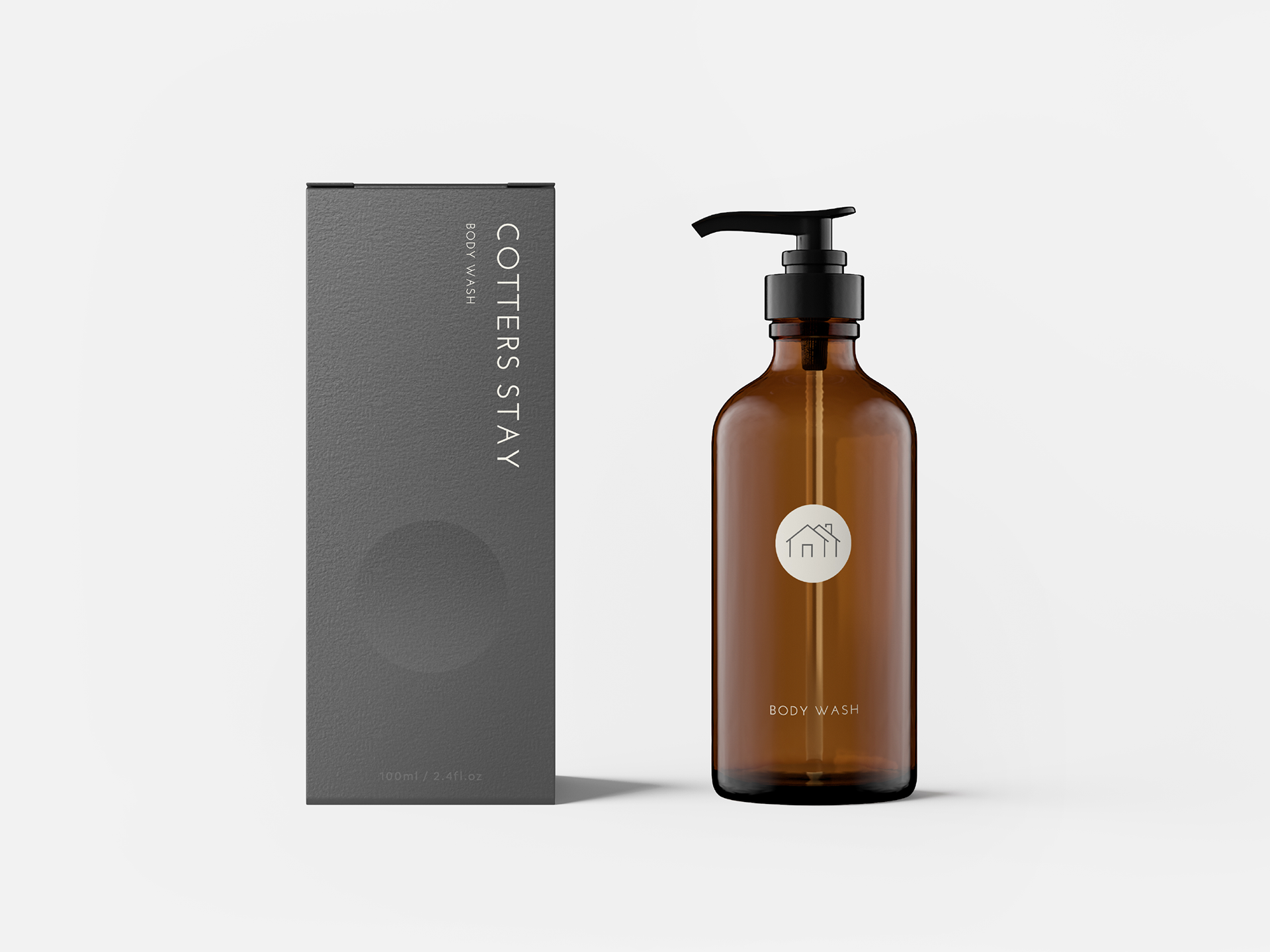
![](https://cdn.myportfolio.com/6d26f1af9317e0791cad1ecdb2112497/10cf23ee-6725-492e-9ffe-773187bc371e_rw_1920.png?h=95033fc1b468d723dc1d79509cc10499)
![](https://cdn.myportfolio.com/6d26f1af9317e0791cad1ecdb2112497/68e0a5f5-efeb-4ddb-a326-ae0e9d145992_rw_1920.png?h=11370d5f0b6cd02af73fe07e6c8c92f4)
![](https://cdn.myportfolio.com/6d26f1af9317e0791cad1ecdb2112497/6a4f3aae-6ce8-462d-8d59-9d33eee75eaa_rw_1920.png?h=1fc223daf9cfd74bee92079829670550)
![](https://cdn.myportfolio.com/6d26f1af9317e0791cad1ecdb2112497/200dbcbb-e993-40a1-b797-4890104894b0_rw_1920.png?h=f7b89a7e94d2d5bb8c11c10238e2f473)
![](https://cdn.myportfolio.com/6d26f1af9317e0791cad1ecdb2112497/b2a82e6a-d013-4a12-bca3-20cbcf0019fd_rw_1920.png?h=1e16aafb5947673d9397522d37899c92)
![](https://cdn.myportfolio.com/6d26f1af9317e0791cad1ecdb2112497/738c8c51-4cbe-4761-a807-032b9d66213c_rw_1920.png?h=36c8be6cc02bb48a644bb659a54e2789)
![](https://cdn.myportfolio.com/6d26f1af9317e0791cad1ecdb2112497/302ae85b-d83b-483e-bf4f-a3bee3a3549a_rw_1920.png?h=ce958b6fc8005e595a433e8132d0d68b)
![](https://cdn.myportfolio.com/6d26f1af9317e0791cad1ecdb2112497/f28f7f8b-ae49-43e5-a529-49cda7f2af6f_rw_1920.png?h=ffabfecc30dff5fc8deadcf0cae2b62e)
![](https://cdn.myportfolio.com/6d26f1af9317e0791cad1ecdb2112497/ec4873be-3ac2-4e75-a090-bf2017355833_rw_1920.png?h=e5ac1059e6c6c5e380b845f97fad2e1b)
Cotters Stay was a brief for the branding of two homestay cottages for hire in the beautiful Lake District. Recently renovated to a high standard, the luxury cottages could be hired for a weekend getaway for those wanting a bit of peace and quiet in the countryside. For this branding, the colours and feel needed to be calm and relaxing as well as have a contemporary edge to reflect the modern style of the cottages. For the colour palette, I used cream and charcoal grey – colours used in the cottage interiors, aswell as the rich greens, ochres and blues seen in the surrounding countryside. For the logo itself, I created a simple keyline icon of two homes and alongside that used an open modern font to perfectly echo the lines in the icon. This was taken through into a main logo, secondary logo, submark, social media and packaging.