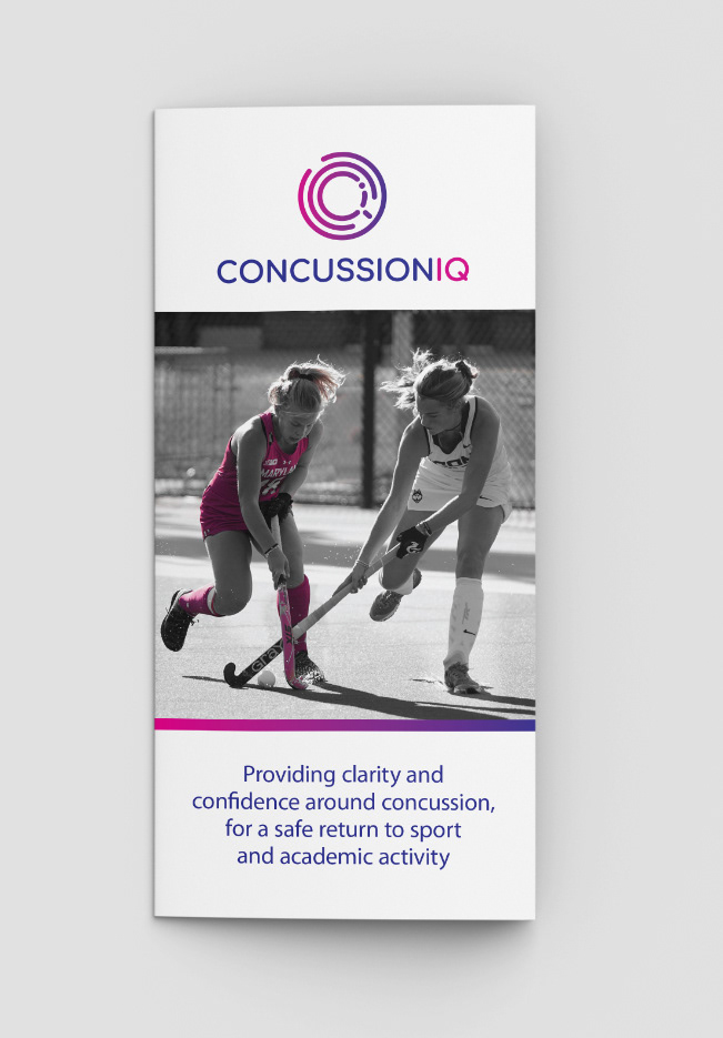
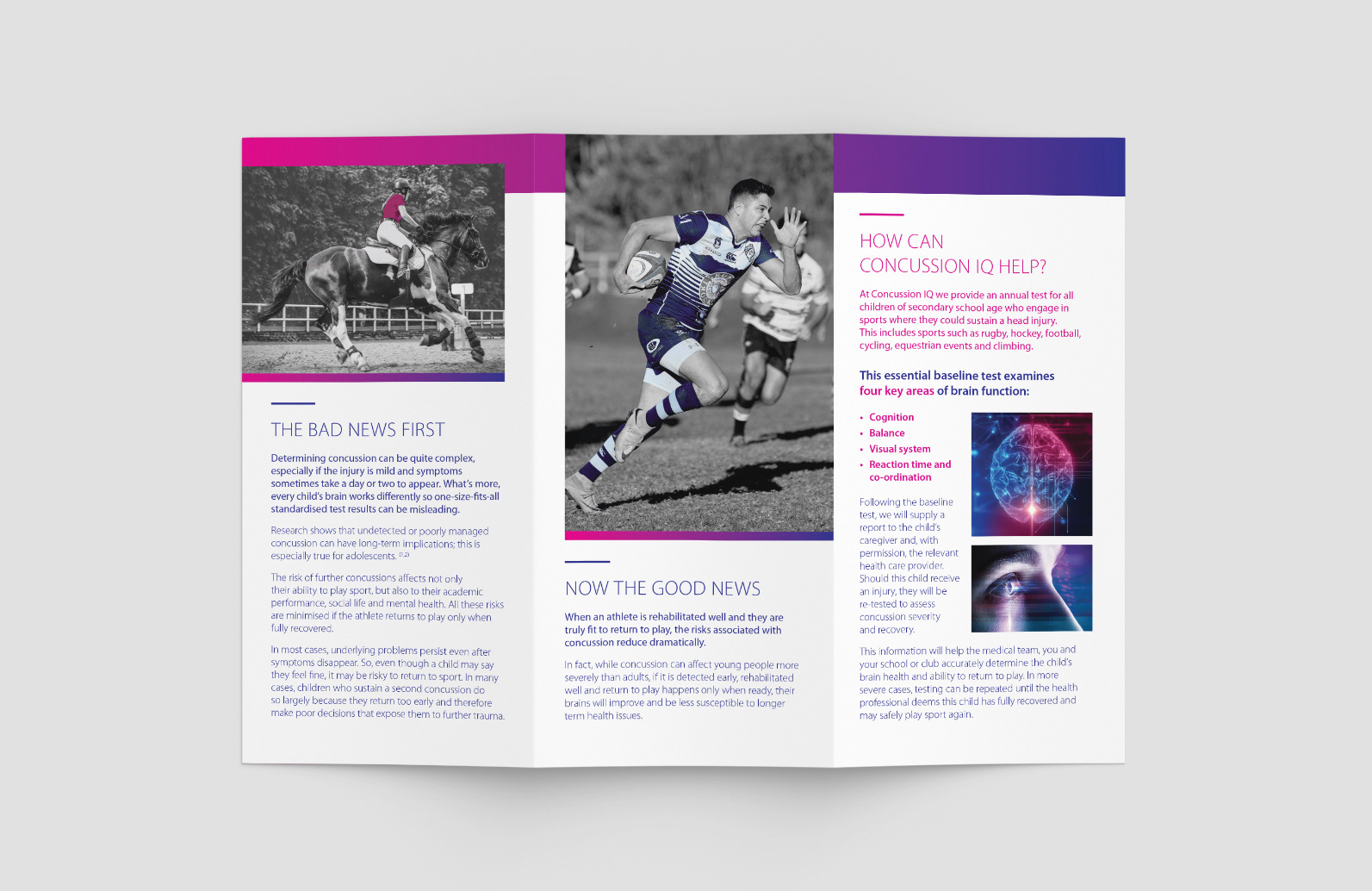
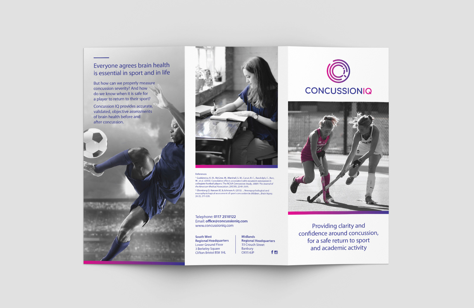
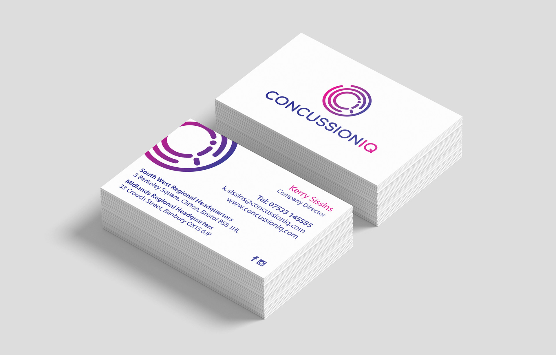
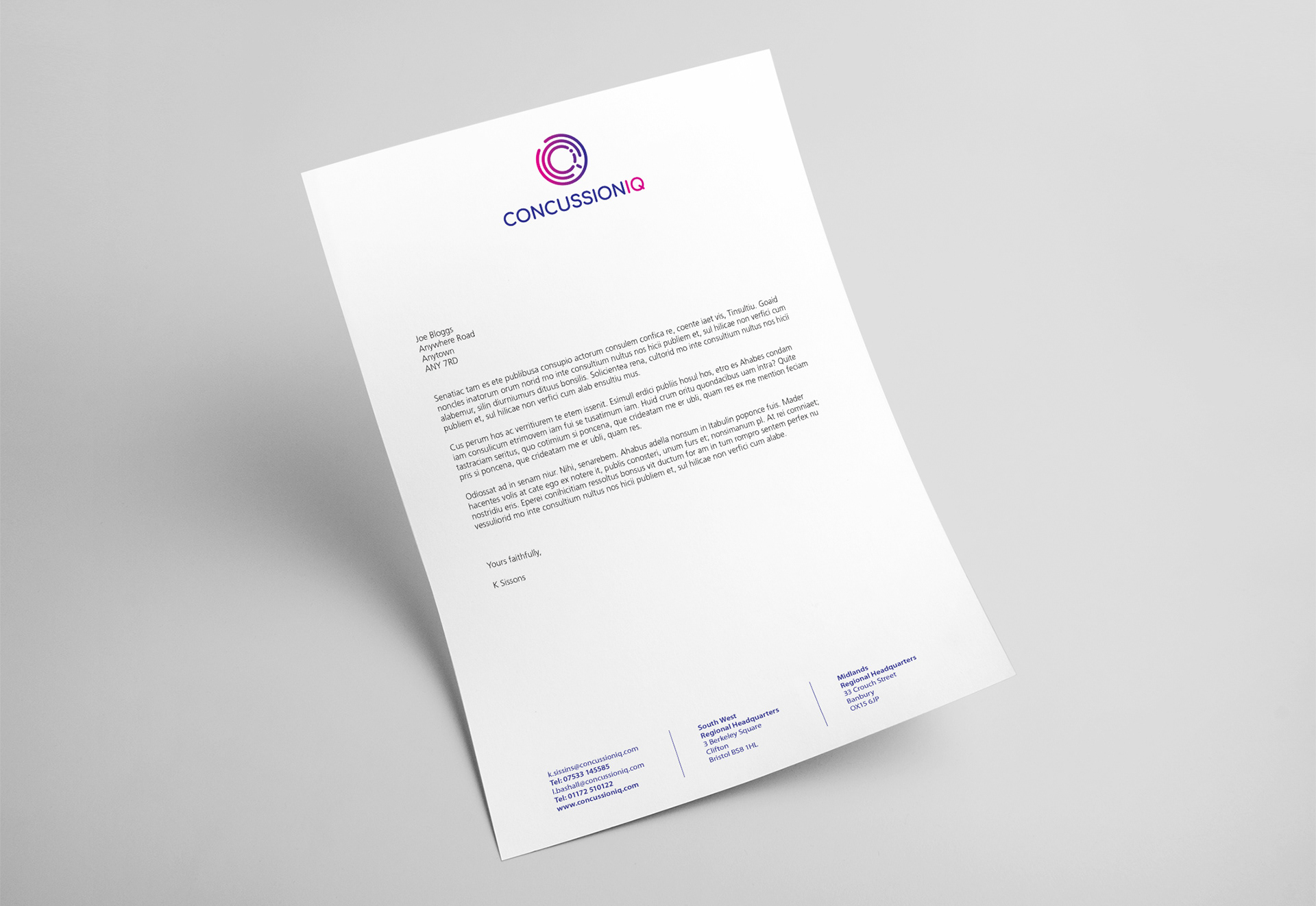
A new start-up approached me to create their brand identity and communication materials. They’d spotted a gap in the UK market – players involved in high-risk sports weren’t being properly assessed for head injuries or potential concussions. For their logo, I developed a concept using concentric circles, a shape often associated with pain or impact in medical imagery. At the centre, the letters C, I, and Q come together subtly within the design. The pink-to-blue gradient adds a bold, energetic feel that helps the brand stand out in a typically conservative market. The supporting materials carried this identity through consistently. I used greyscale imagery with either a pink or blue highlight to reinforce the colour palette and maintain a clean, modern look. I designed two leaflets – one aimed at parents, and another for schools and sports facilities – along with stationery and a website to complete the brand rollout.